iCoMut Documentation
iCoMut Version: iCoMut_Beta-0.21 | 509cb43975f4
Comut plot, introduced by Nicolas Stransky, is often seen in cancer research publications as a visual summary of genetic variations/mutations in cancer cohorts. The plot itself is essentially an ensemble of multiple smaller and simpler plots (e.g. heat maps and bar graphs) aligned and interconnected via a common X or Y axis. iCoMut arranges patients along the horizontal X axis, with analyses and clinical parameters along the vertical Y axis. This form of grid-like graphical summary is particularly suitable for presenting data with an intricate and associative nature. iCoMut aims to further transform the static image into an interactive data exploring experience that is flexible and versatile, and through a web-enabled user interface, provides greater public access.
Broad TCGA GDAC data and analyses summaries provided by Jaegil Kim, Hailei Zhang, Juok Cho, and David Heiman.
iCoMut is developed by Katherine Huang, Sam Meier, Tim DeFreitas, Nome Shoresh, Eila Arich-Landkof, Michael Noble, Gad Getz at Broad Institute.
Tutorial
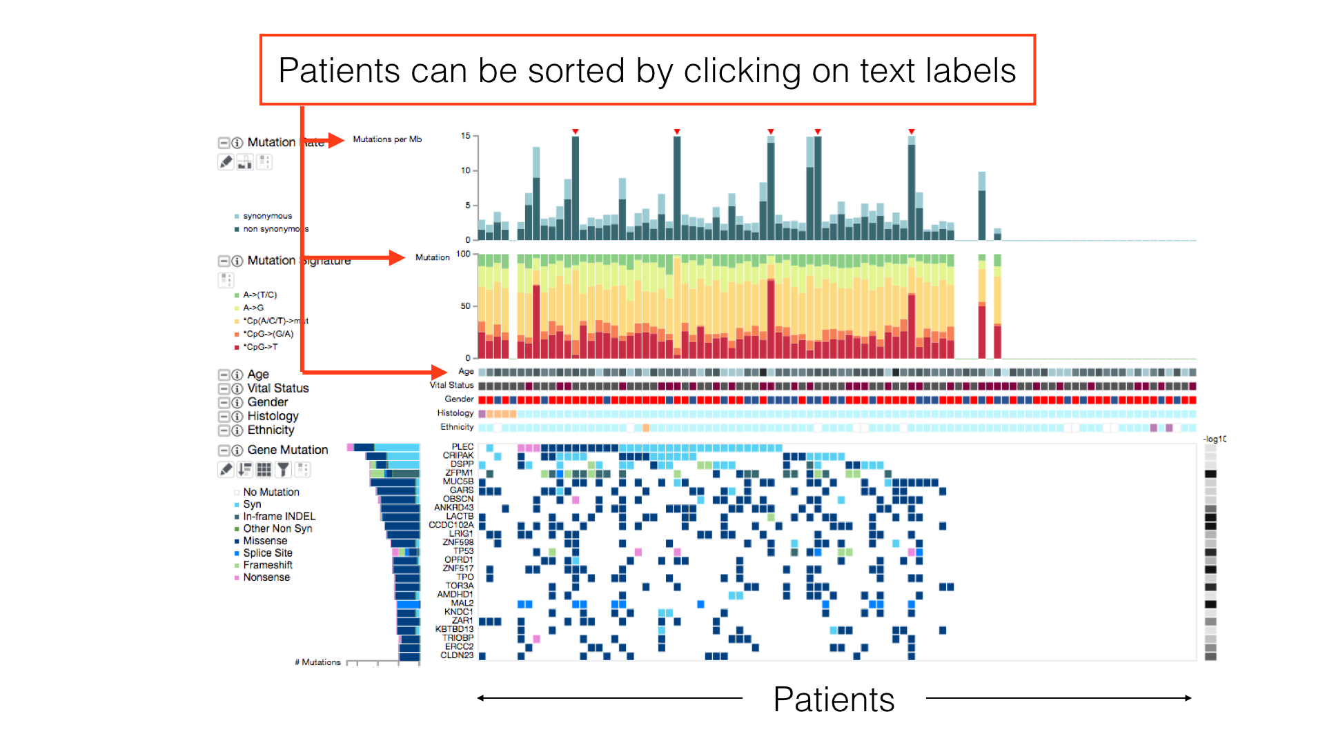
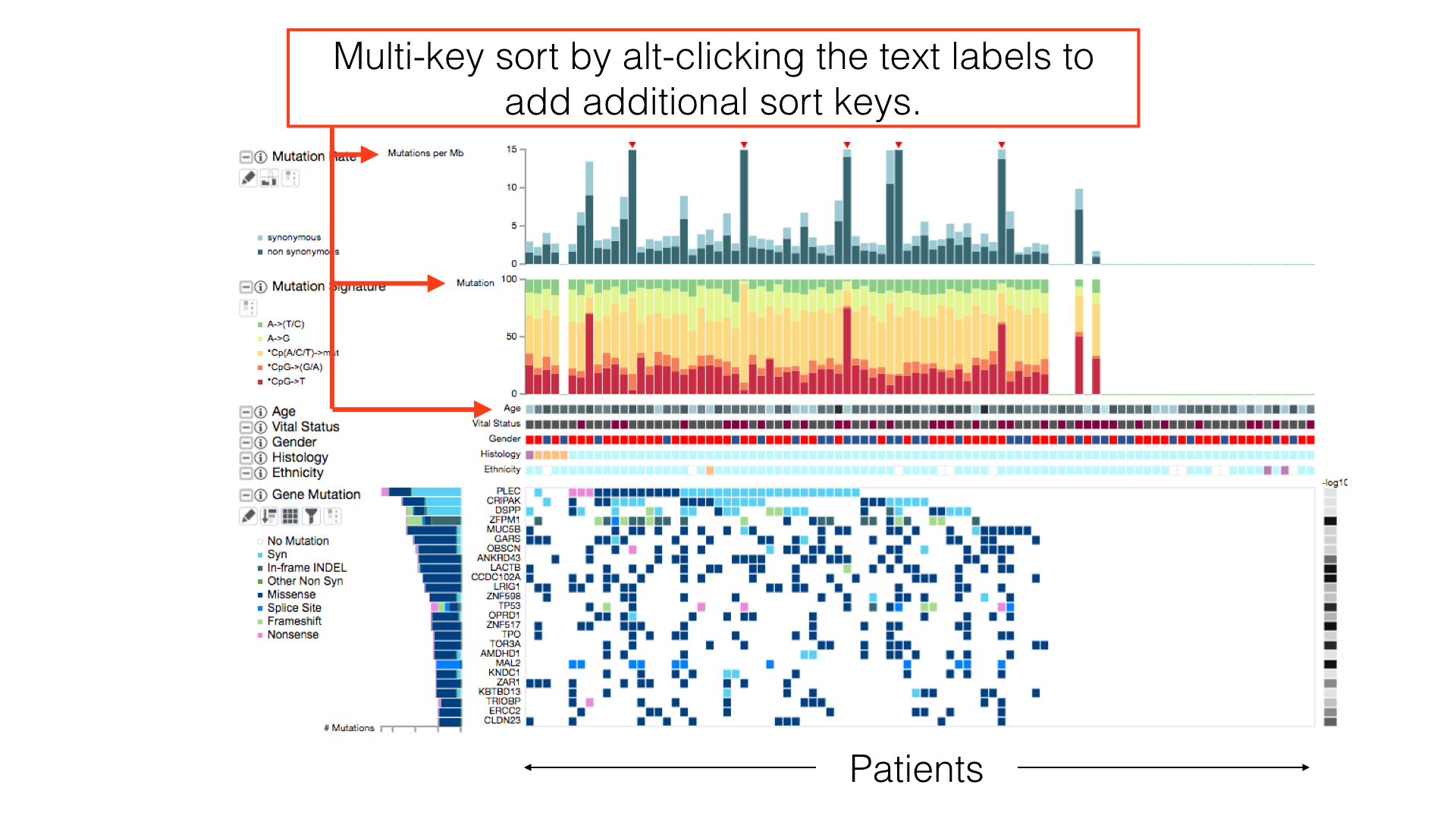
Data Sorting Options
By default, patients in a cancer cohort are sorted first by the histological subtypes (if available), then by the gene mutations.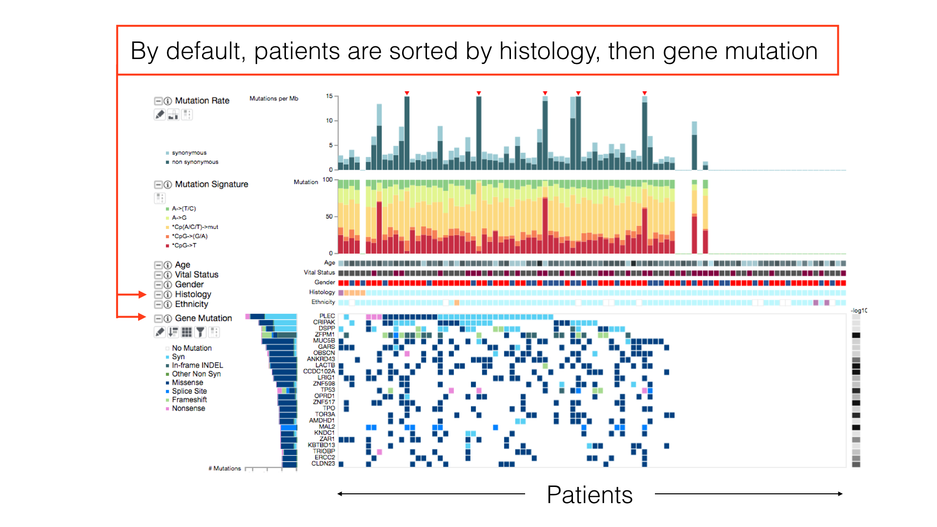
The Info Panel
The info panel reports the sorting status of the patients and the box is draggable for adjusting its location on screen. The info panel will also show additional information about iCoMut data.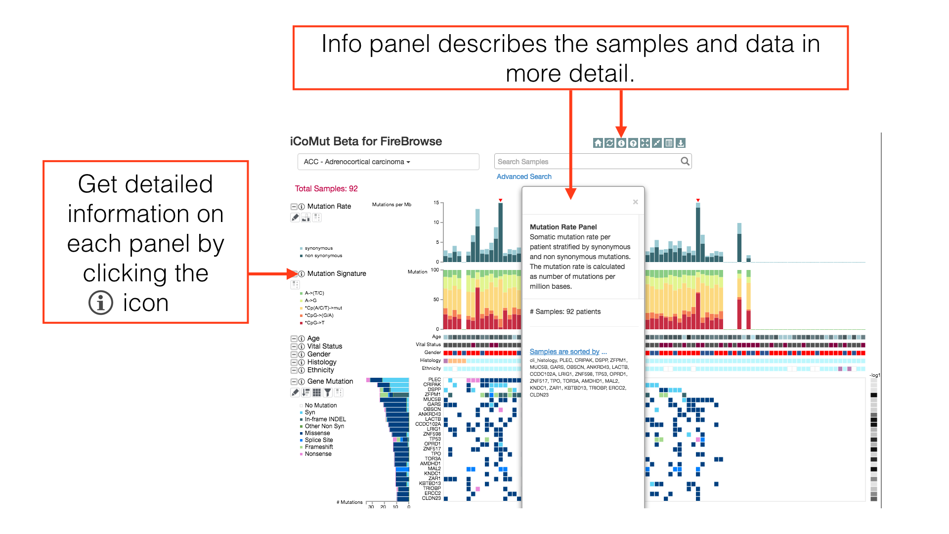
Panel Layout
Click and drag a panel's title to rearrange the order of displayed panels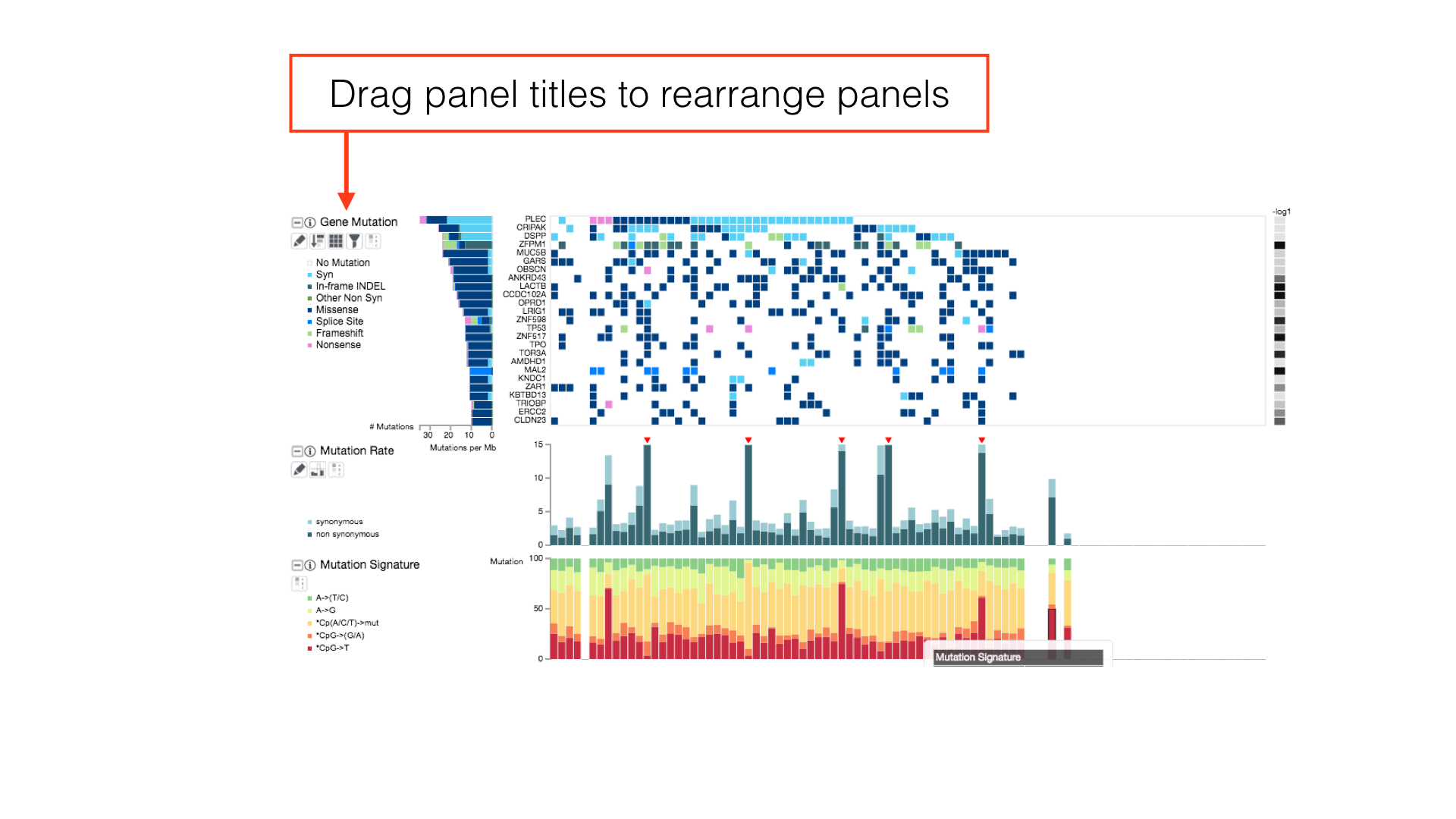
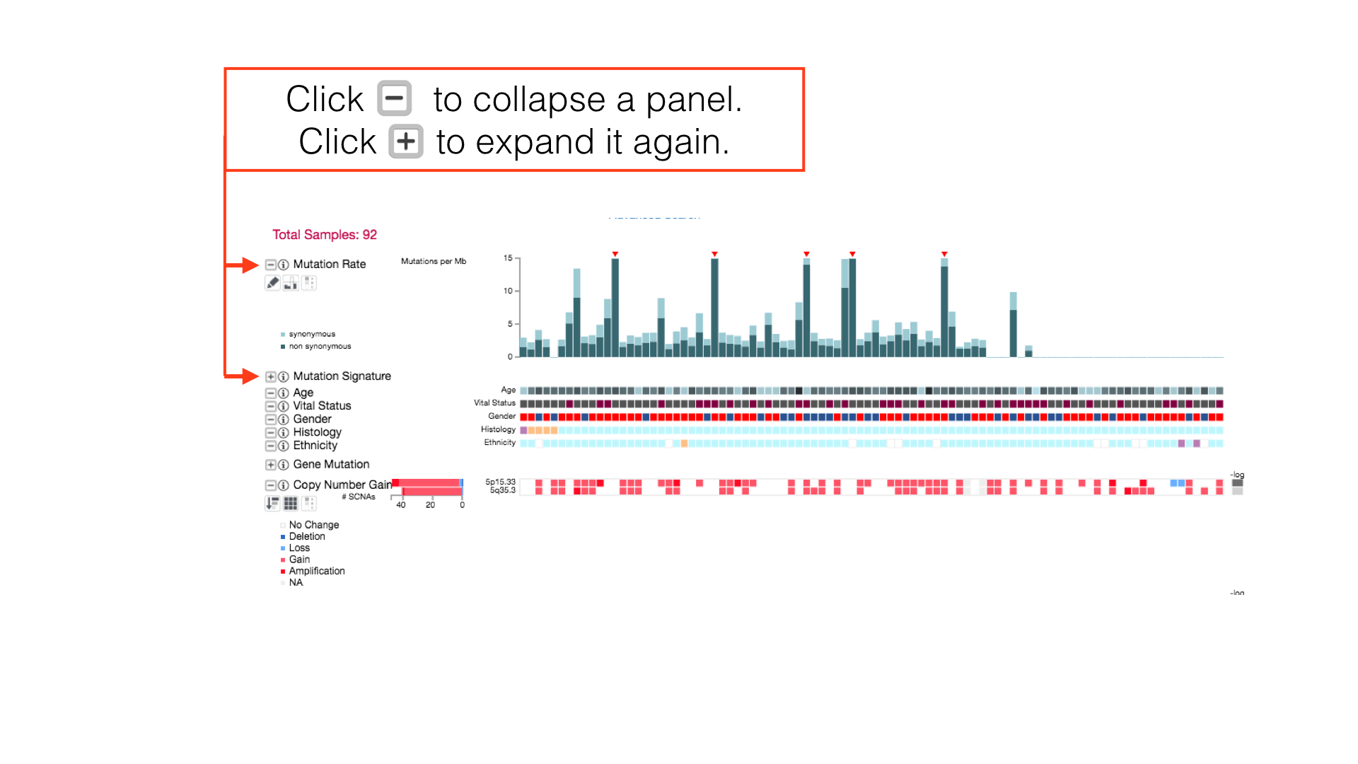
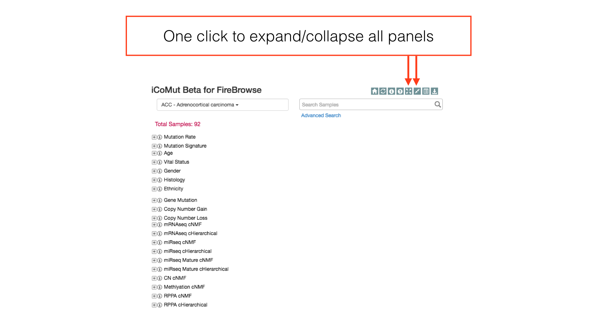
More Panel Options
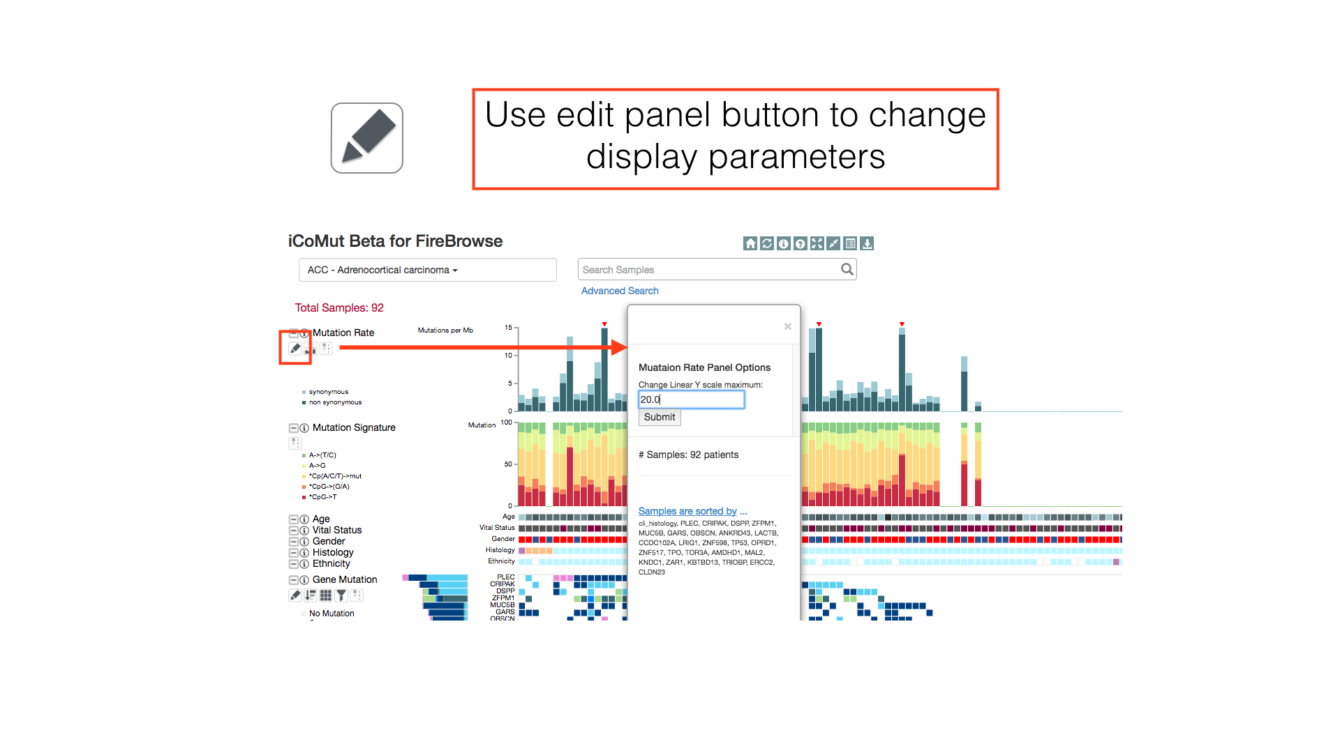
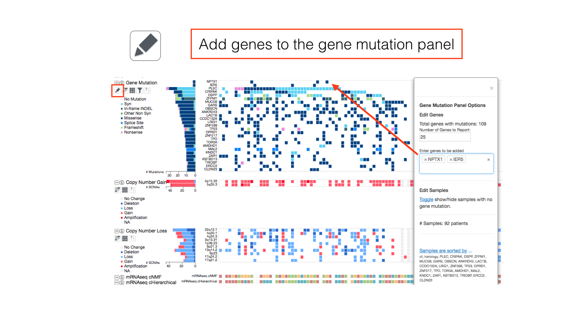
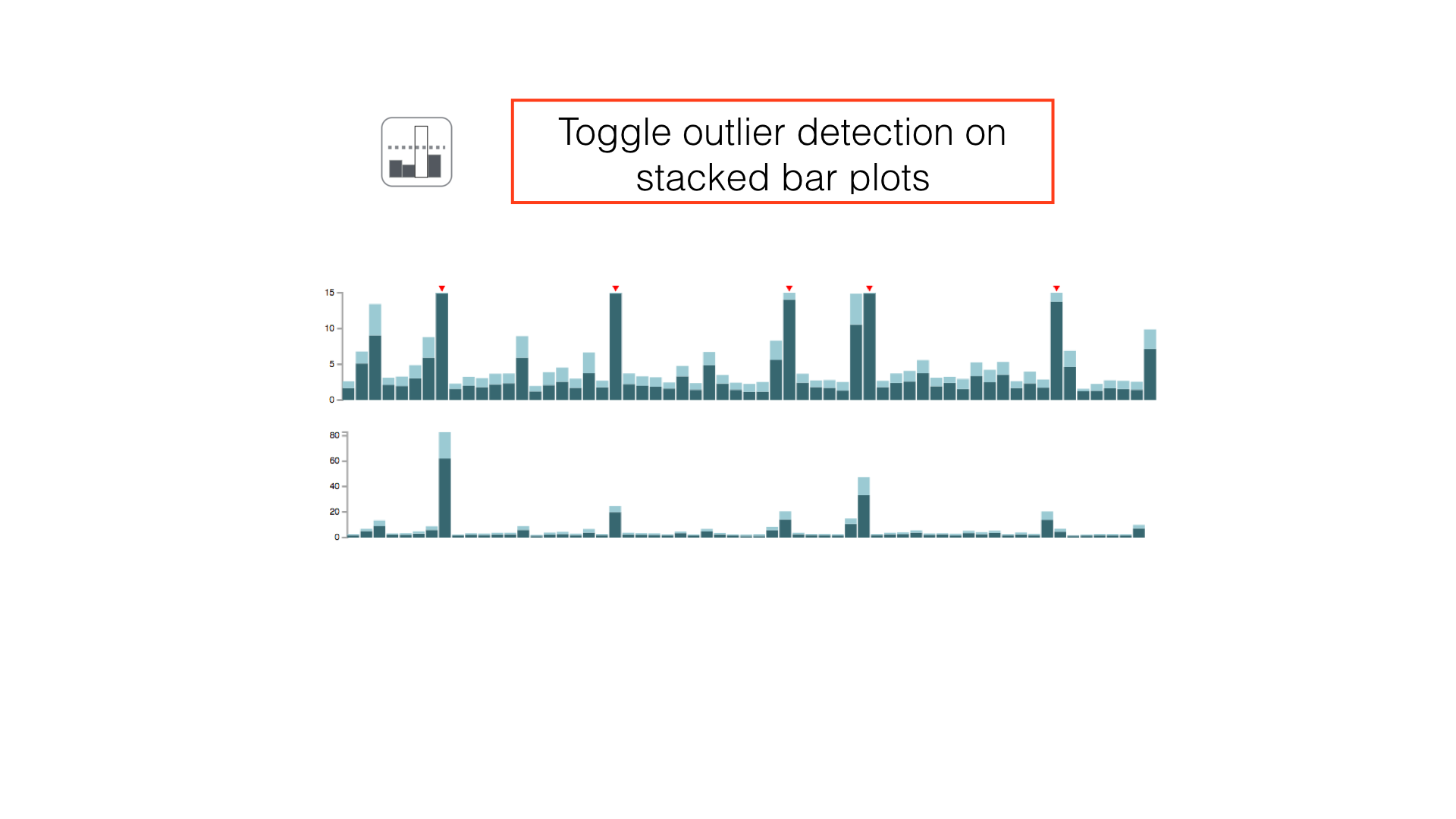
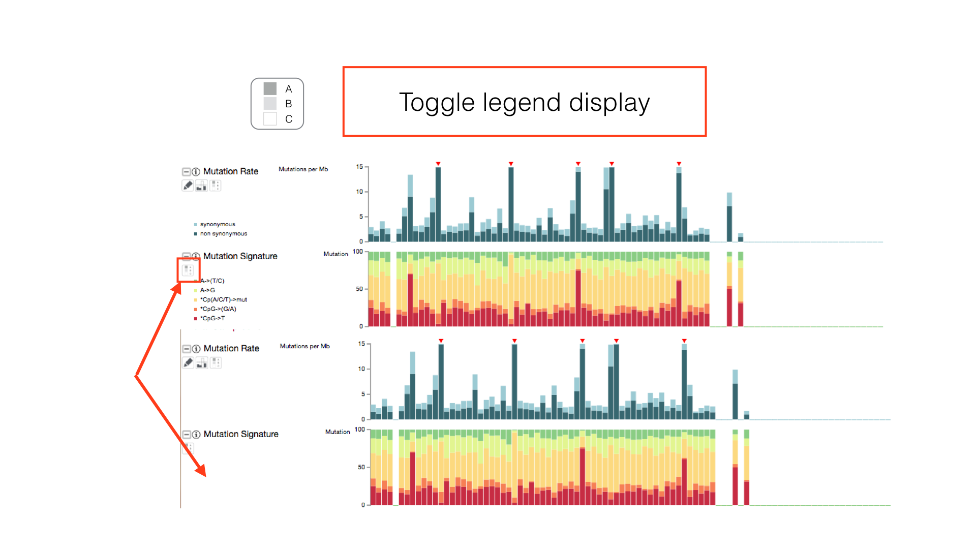
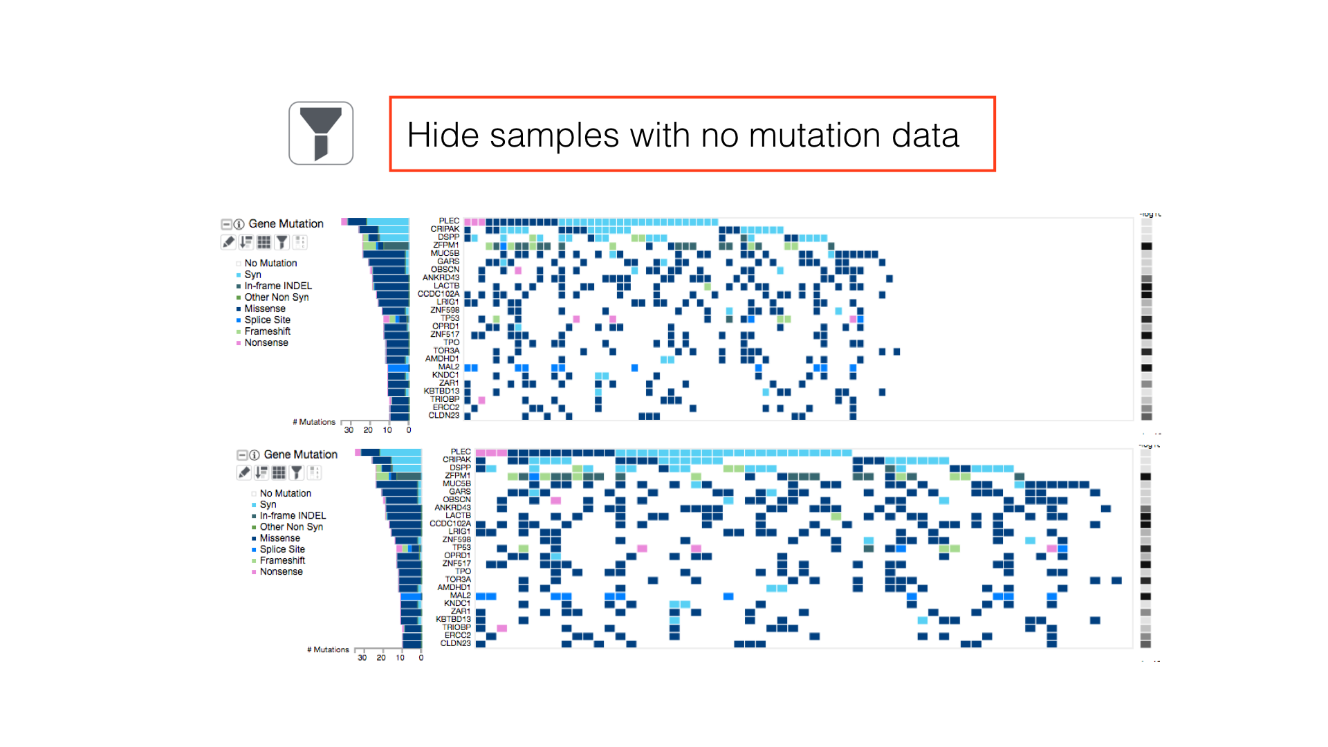
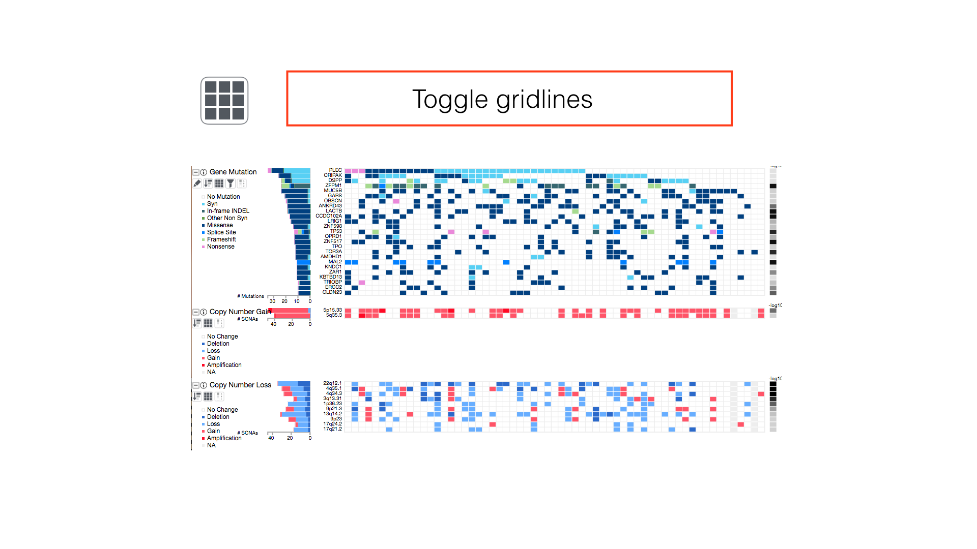
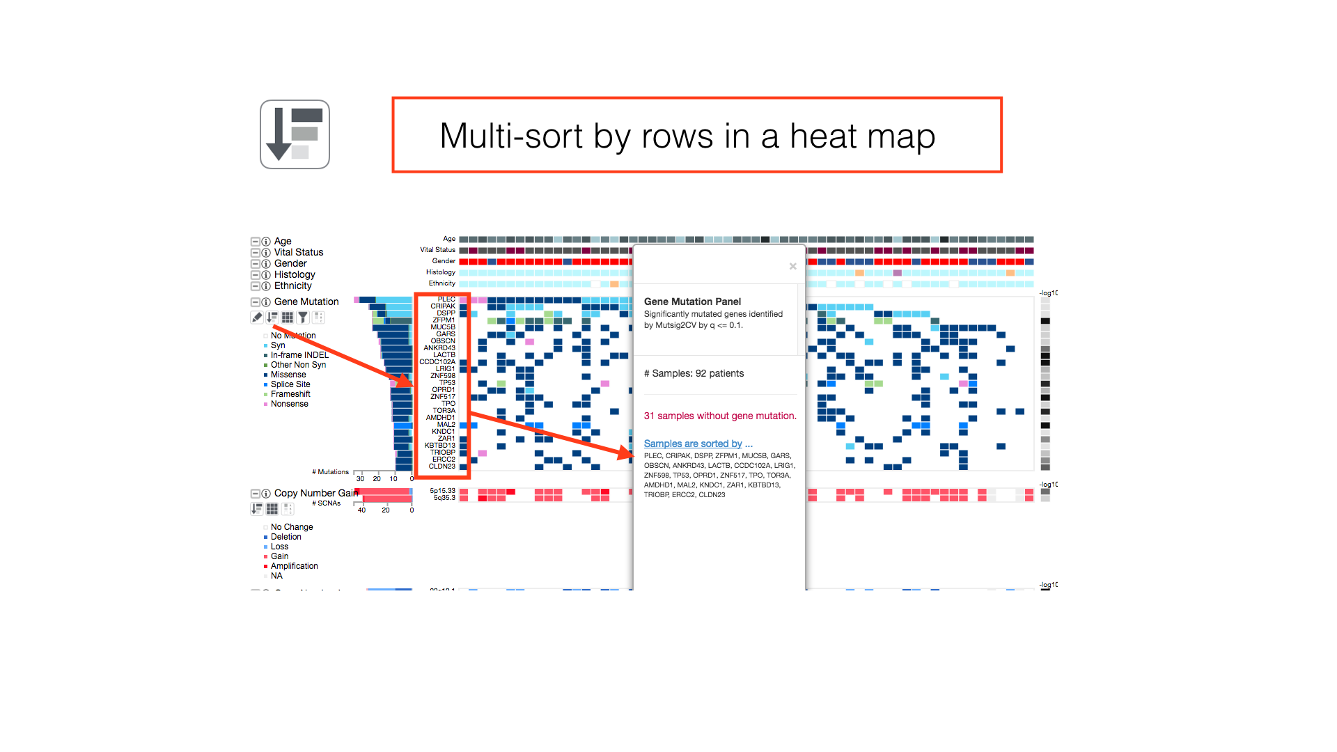
Some panels can have their display properties tweaked using the panel toolbar buttons.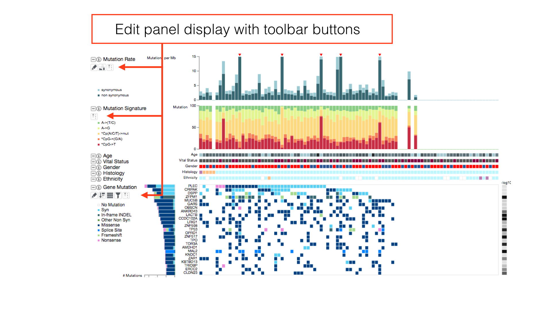
View All Legends
Show the clinical and cluster legends with the toggle hidden legends button in the main toolbar.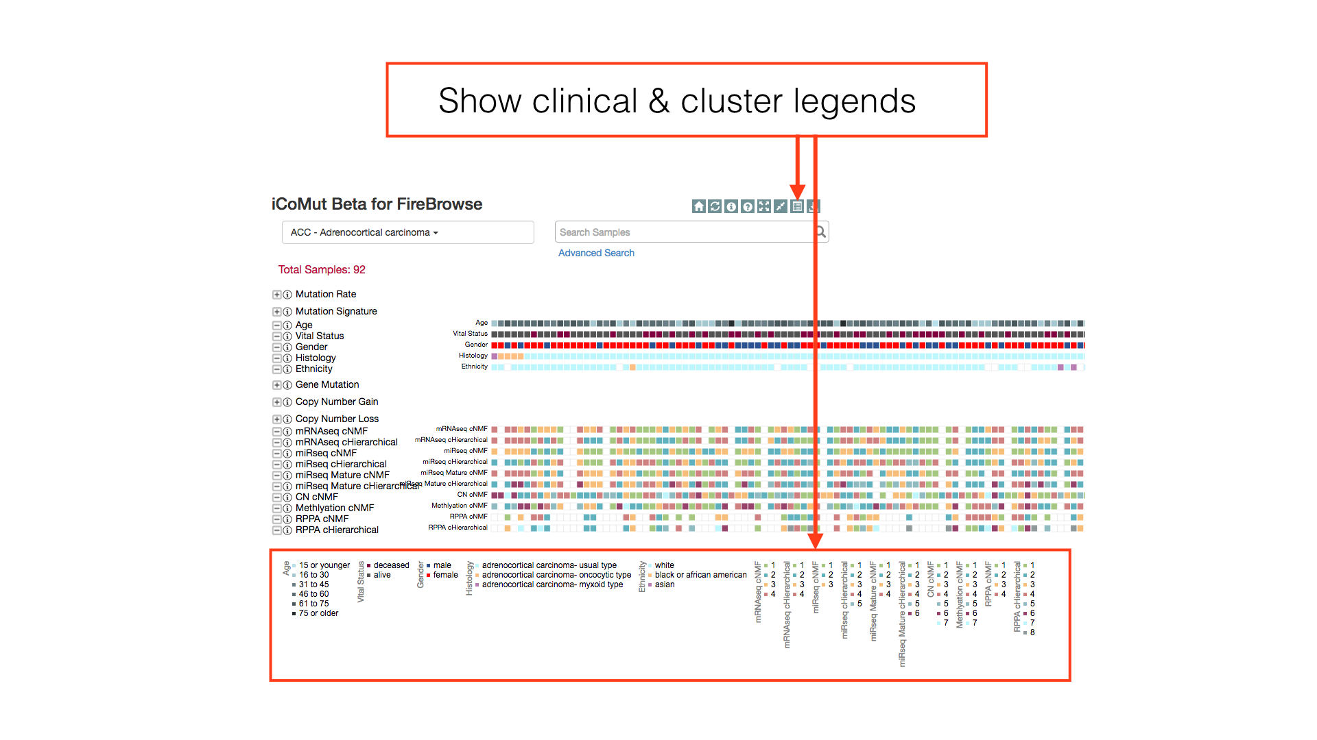
Reorganize Heatmap
Drag row labels to change the display order of rows in a heatmap.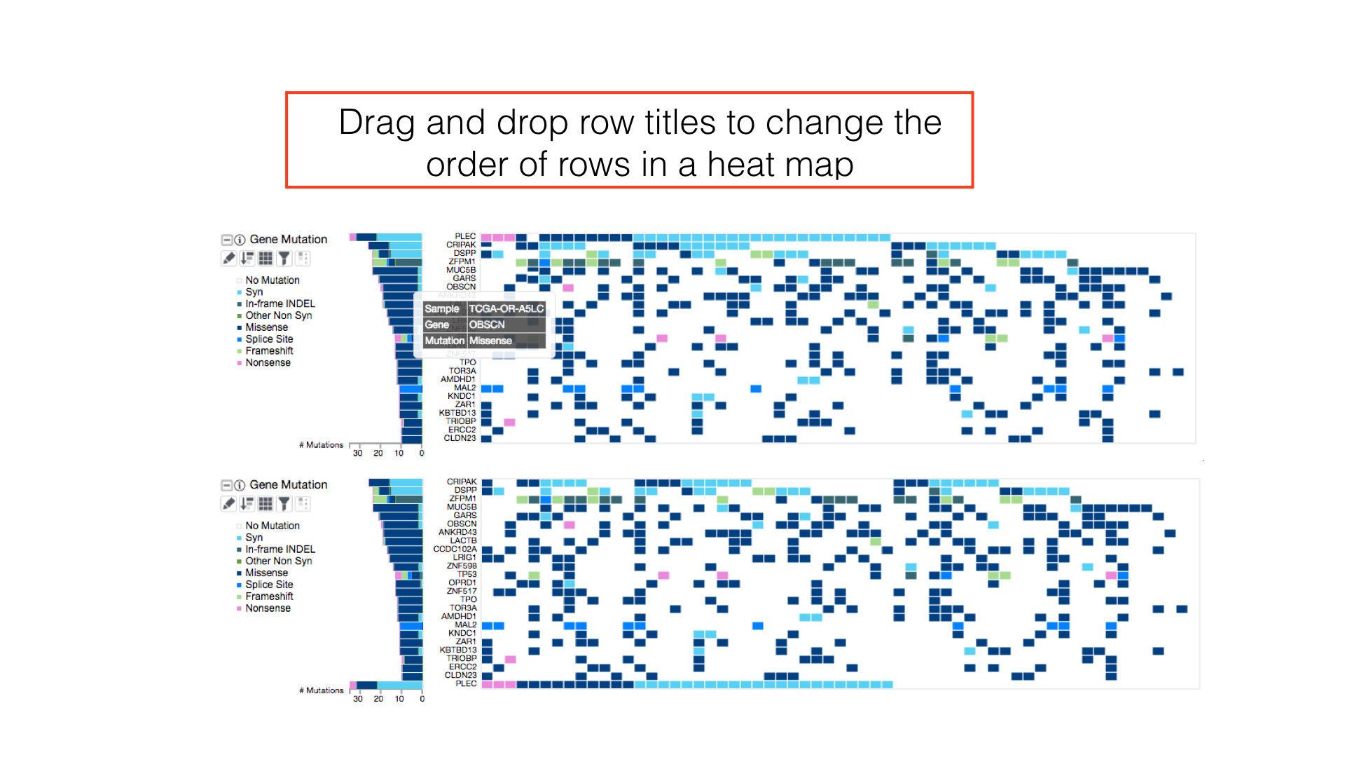
Sample Search
Use the sample search bar to highlight individual patients by TCGA barcode. Regular expression matching can be used to select multiple patients in a single search token.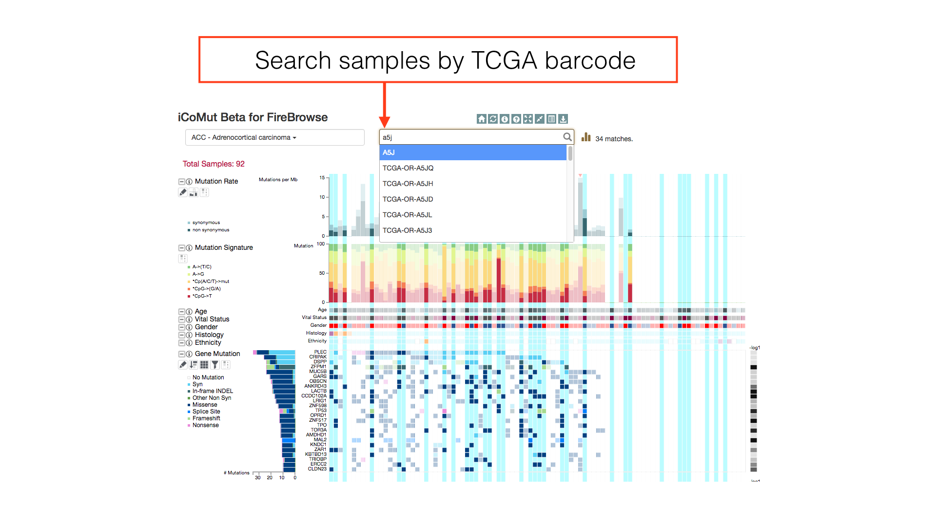
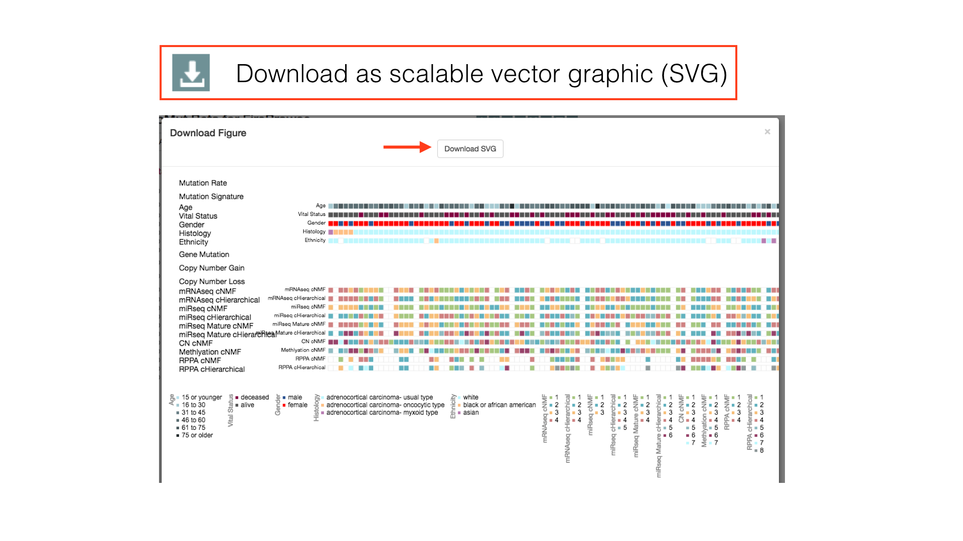
Download Figure
You can view a printable version of the figure by clicking on the 'Download Figure' icon in the main menu. From the preview popup, you may download an SVG image of your generated figure, which contains an embedded link to a live version of the data.